Carla Accardi oroargento
paintings 1964-1965
13.12.2025 — 24.04.2026

Show introduction
The exhibition is dedicated to a selection of works by Carla Accardi created between 1964 and 1965. The paintings, which are now brought together for the first time into a clearly defined core, are characterized by the use of gold and silver pigments, a choice with which the artist expresses a completely new personal reflection on the relationship between sign, light, and pictorial space.
The exhibition, in collaboration with Archivio Accardi Sanfilippo, brings together large-scale canvases from the artist’s collection, some already exhibited in Italy and abroad in the 1960s, which testify to one of the most intense creative phases of her career. In 1964, she was invited to the XXXII Venice Biennale to exhibit her artworks in a personal room. In the relating catalogue text, Carla Lonzi emphasizes how Accardi “passed through Informalism without the possibility of identifying with it, but rather sensing its presence as an obvious and pre-existing fact.”
The artist then chose to employ these pigments for the first time, decisively shifting her painting toward a new dimension of luminosity, engaging the space beyond the confines of the canvas, in a dialogue that, in the same years, led her to conceive her first radical environmental experiments with sicofoil.
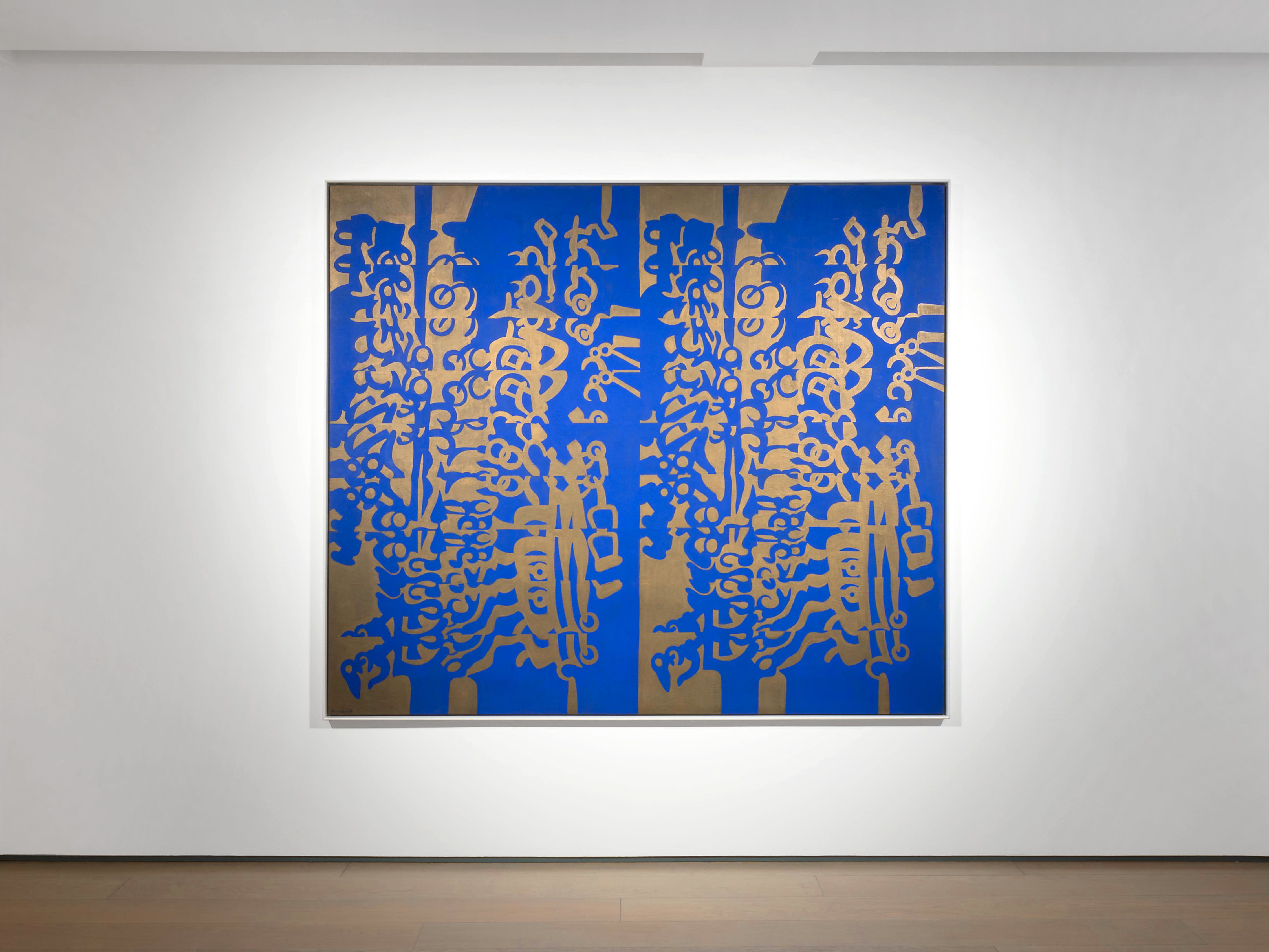
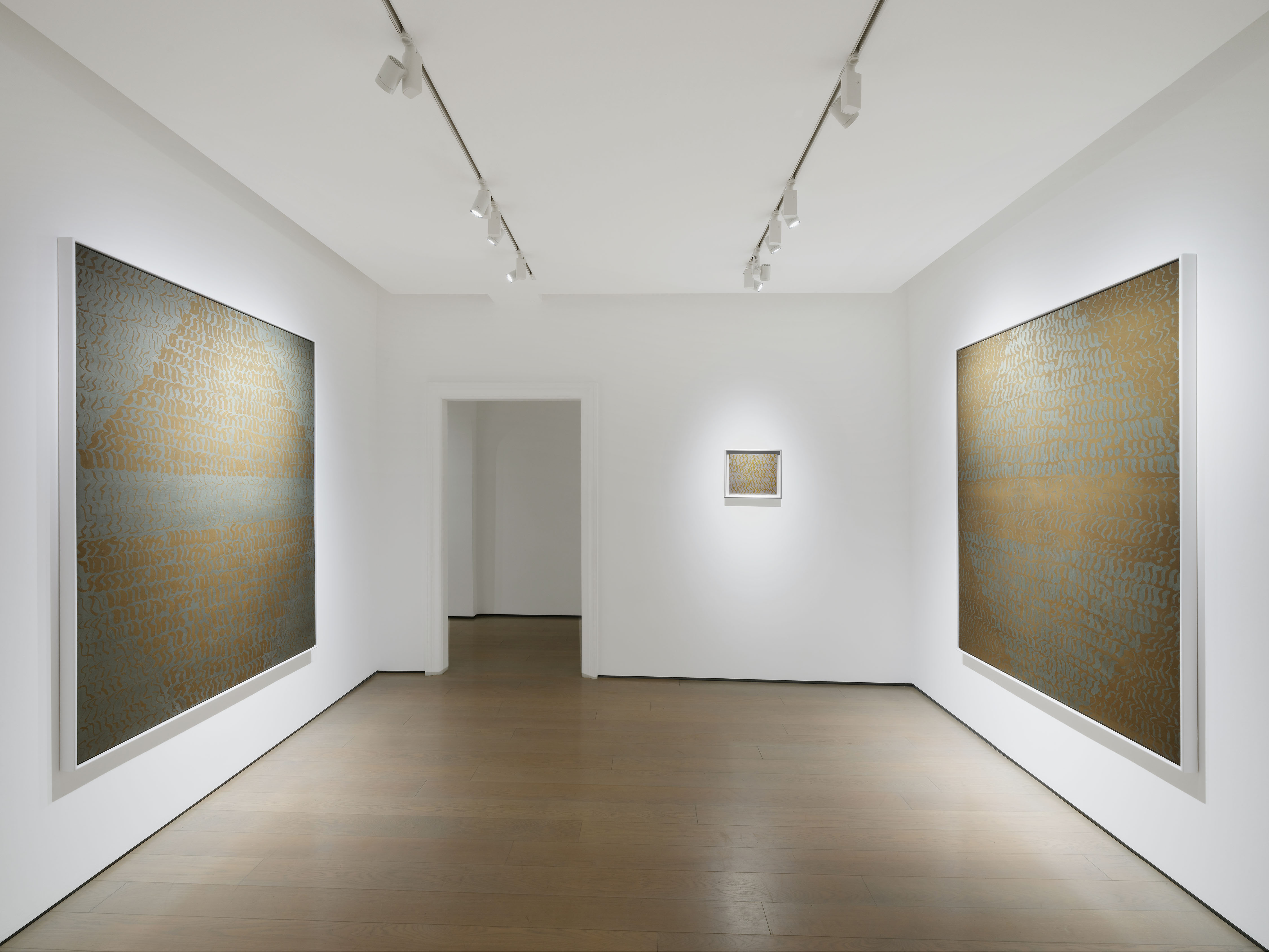
Carla Accardi not only exploits with gold and silver the optical effects of two-tone colours already employed in many works from the beginning of the decade, but also intercepts the reverberations of external light through the reflective properties of metal colours. The surfaces of the canvases collected here are configured as constantly changing visual fields: depending on the observation point and the angle of incidence of the light rays, they come to life, vibrate, and are charged with reflections and shadows.
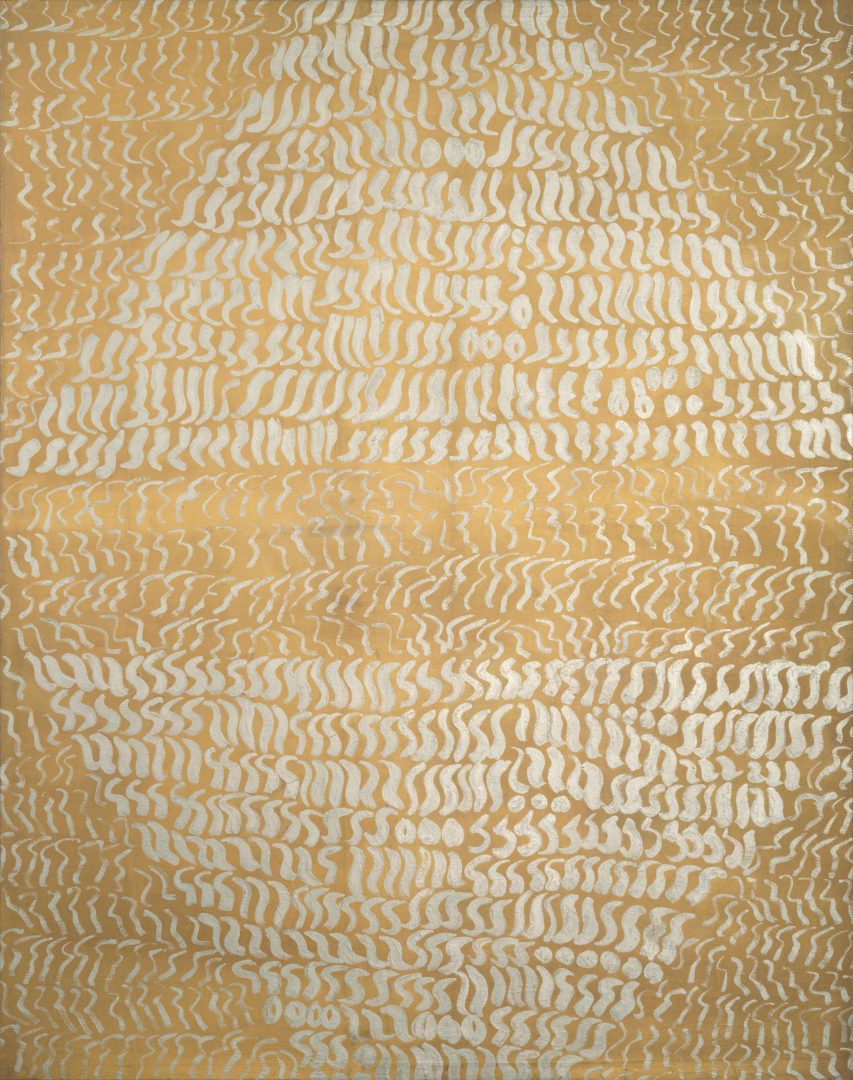
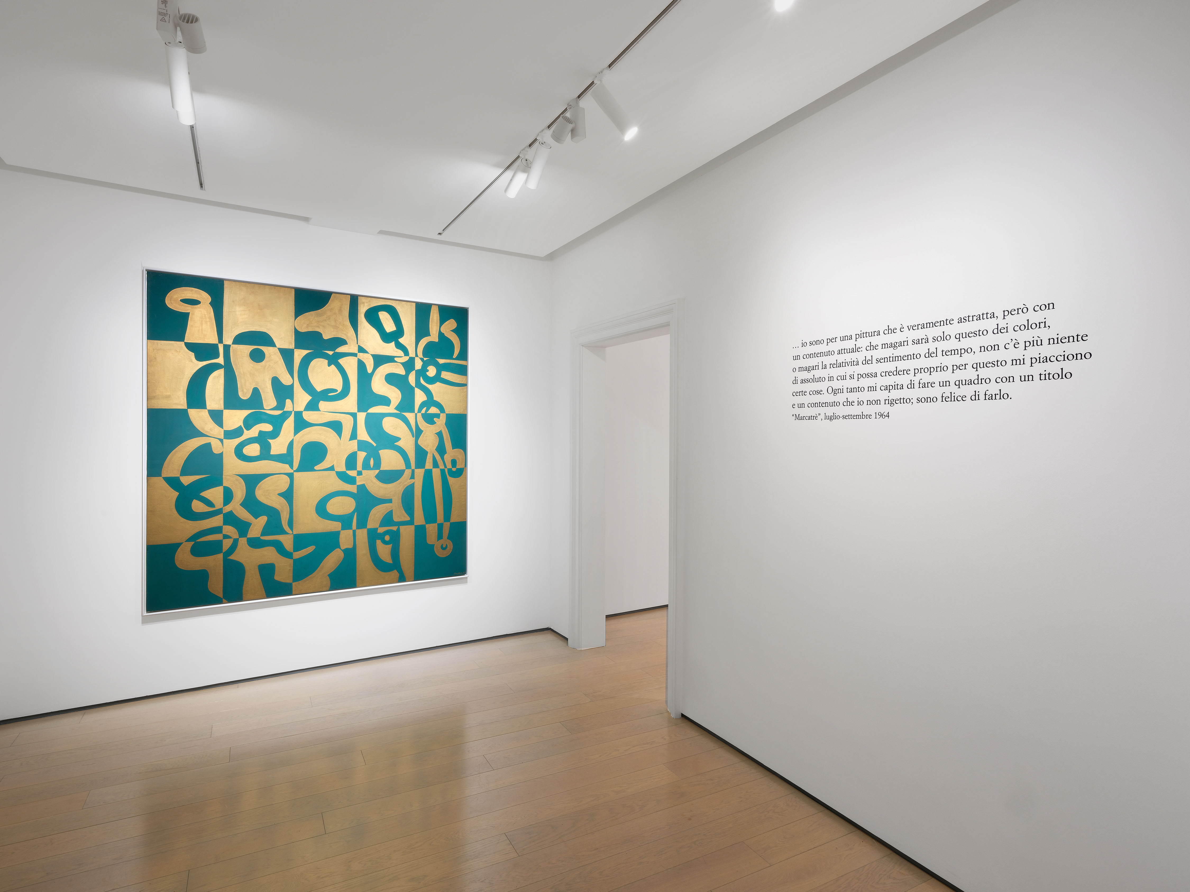
In Grigio scuro oro, Argento oro 1, and Argento oro 2, created in 1964, the nature of the marks and their arrangement on the surface closely recall the structure of the paintings the artist chose to exhibit that same year at the Venice Biennale. Diagonal bands, horizontal stripes, lozenges, and parallelepipeds, within which this singular alphabet is imperfectly repeated and organized in a ceaseless and surprising invention, recall the structures of contemporary masterpieces such as Omaggio al Presidente Kennedy and Oriente, presented in the Venice exhibition.
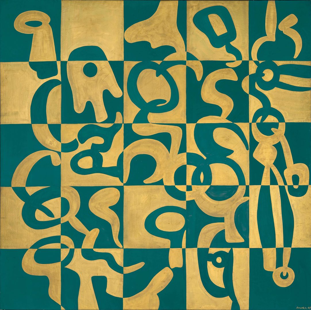
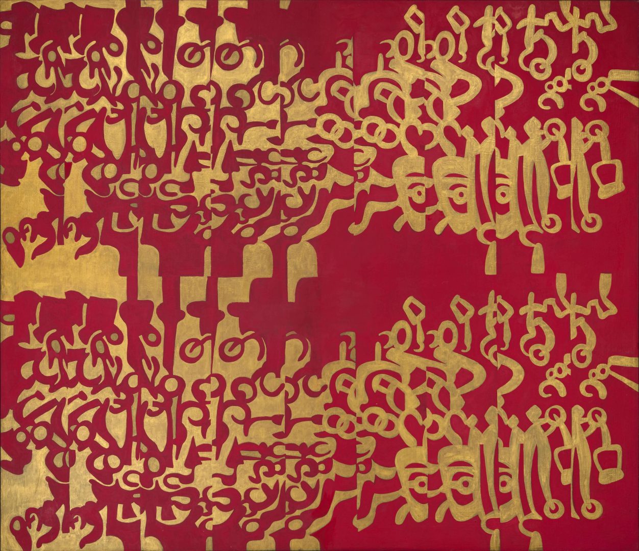
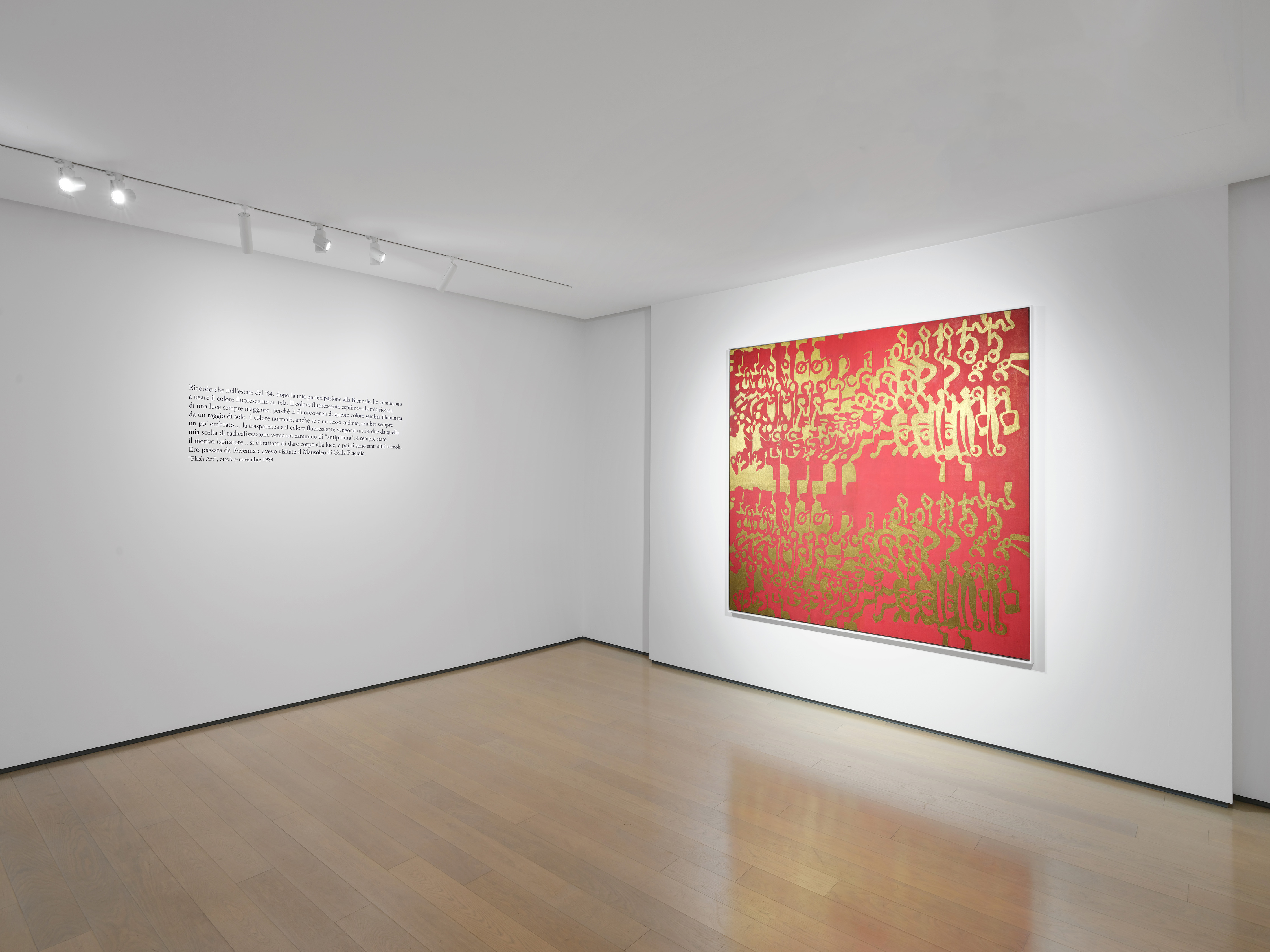
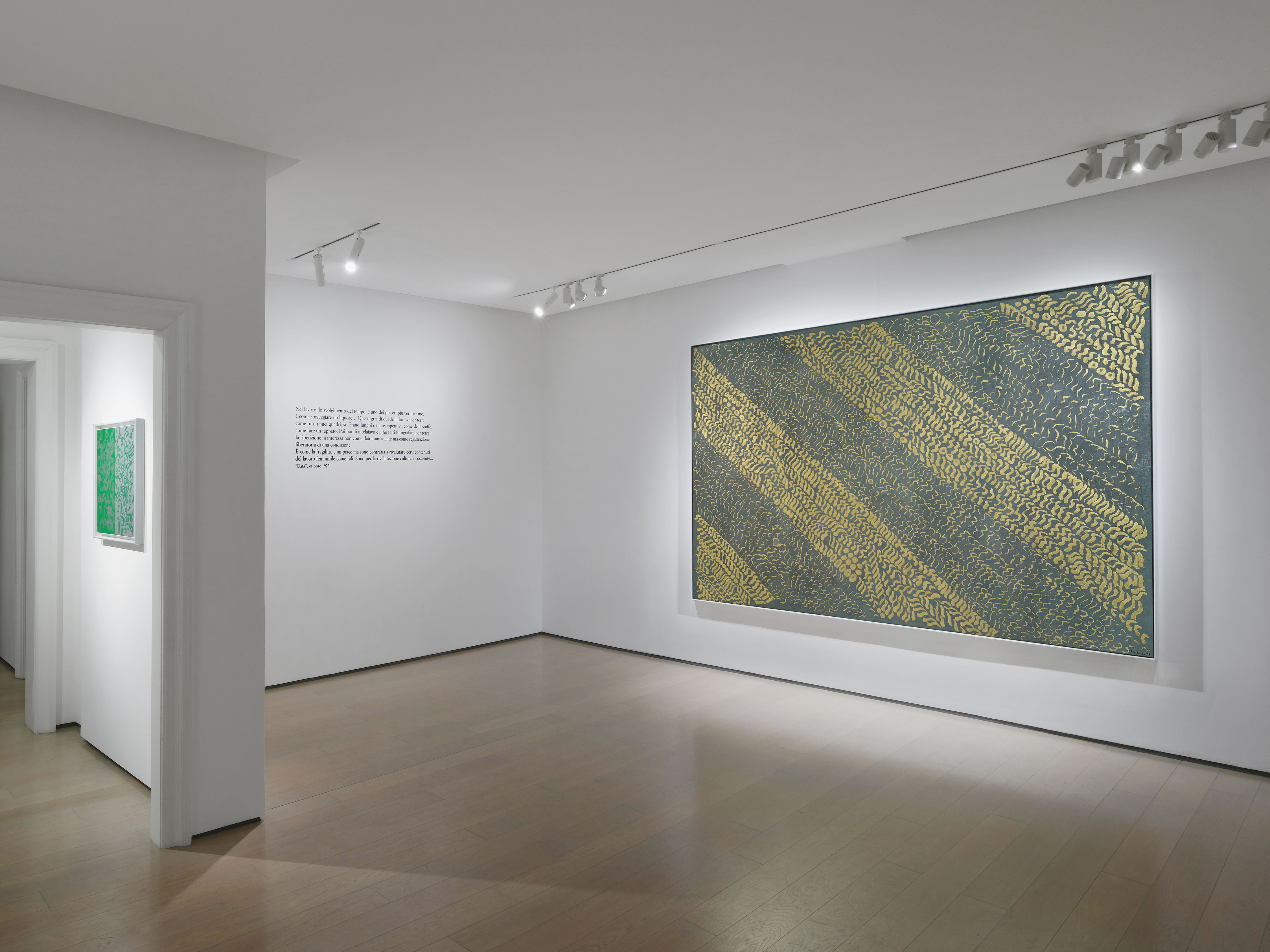
Ororosso (Oriente n. 1), Oroblu (Oriente n. 2), and Scacchiera oroverde, from the following year, respond to different criteria in the conception and arrangement of the marks, now enlarged and arranged in more regular sequences. Now paint and background alternate and acquire the same role in the formulation of the image. Her research thus unfolds according to a new variation in compositional rhythm, yet within a coherent exploration of painting, begun in the mid-1950s with her black-and-white works, in which she explores the tension between figure and background, between implicit light (the shining white) and deep darkness (the black surface), and vice versa. This same exploration is reworked in the artworks from the early 1960s, where colour, in its bright and fluorescent complements, defines space, playing with the optical properties of light.
In particular, Scacchiera oroverde is among the canvases exhibited in the spring of 1965 in the solo exhibition at Galerie Stadler in Paris, presented in the catalogue by Umbro Apollonio, with a note by Michel Tapié. “The graphic marks... are now arranged in more or less tightly packed sets and within clearly defined sections or bands, but they do not remain inert because the encounter with the other colour triggers a pulsating vitality spreading across the entire surface,” the Italian critic observes.
The series of paintings from 1964-1965, now brought together in Verona, represents one of the most enigmatic and sophisticated stages of a particular experiment: gold and silver become vehicles of light, materials interacting with the surrounding space; the image is not confined within the frame but acts through inversion, opening, and reverberation. The paintings of this period demonstrate a striving for a new “luminous density”: the lines become essential, pared-down, yet powerful in their ability to modulate perception in relation to the viewer and viewing conditions.
As early as October 1964, Gillo Dorfles emphasized in the catalogue of her solo exhibition at Galleria Notizie in Turin the “brilliance” effects achieved through fluorescent and silvery colours, juxtaposed to create new “wonderful chromatic explosions.” Later, in Data, March-April 1976, Anne Marie Sauzeau Boetti, an intellectual who updated the Italian art system with respect to the theoretical debate on feminism, noted how Carla Accardi’s expressive universe exploded with “the blinding, impulsive, anti-nature two-tone, produced by technology (fluorescent) or alchemy (gold/silver).”
It would be Carla Accardi herself, in an interview in Flash Art from October-November 1989, who offered the key to understanding the genesis of these paintings. “I remember that in the summer of ‘64, after my participation in the Biennale, I began using fluorescent paint on canvas. The fluorescent colour expressed my search for ever greater light, because the fluorescence of this colour seems illuminated by a ray of sunlight, while the normal colour, even if it is cadmium red, always seems a little shaded. As for the transparent material, which I then used, I had the opportunity to use it for something they had asked me to do. Thus, the transparency and the fluorescent colour both stem from my radical choice towards a path of ‘anti-painting’; it has always been my inspiration... I had passed through Ravenna and visited the Mausoleum of Galla Placidia.”
On the occasion of her 1989 retrospective at Galleria Civica in Modena, also displaying Grigio scuro oro from 1964, Marianne Brouwer offered further insights. “When I look at her works,” she writes in the catalogue, “I have the feeling of engaging with an ancient tradition, to which this conception of light, or rather this experience of light, can be traced. I am reminded, in fact, of those Persian mosaics traversed by calligraphy that extends to infinity; the luminous domes of Arab mosques, and the inscriptions covering their walls all around. This is not simply an aesthetic comparison, but also a philosophical question... the quality of light... is the image of earthly truth.”
The exhibition is accompanied by a rich series of works on paper. This, too, is a cohesive and unique core, created using gold and silver pigments on coloured paper and never before exhibited in public as a whole. In a space once again resolved in two-tone, Carla Accardi designs a series of “skeins,” as she calls them, in which the lines unfold freely and become entangled in continuous circular sequences, moving toward the centre of the sheet of paper or expanding to its outer edges. These works echo what Germano Celant, in 1999, called “the dance of reflections,” which “pushes colours and surfaces to fluctuate, to reverberate a light and mobility being continuous intercommunications between the polarities of art and the environment.”
For the occasion, Galleria dello Scudo is publishing a catalogue in Italian and English with texts by Bruno Corà, Paola Bonani, and Daniela Lancioni, and a rich array of illustrations.
Installation view

Artist
Born in Trapani in 1924, she was one of the founders of the Forma group in 1947. Michel Tapié invited her to exhibit in numerous exhibitions in Italy and abroad; Pierre Restany introduced her solo-shows at Galleria Notizie and at Galleria La Salita, respectively in Turin and Rome. Color, sign, experimentation are the distinctive features of her research, which is radicalized in the use of transparent plastic supports, the sicofoil.